
The General Insurance
Competencies
Experience Audit
User Research
Competitive Analysis
Stakeholder Interviews
Early-stage Strategic Thinking
Enterprise Mobile Strategy
Workflow Definition
Interaction Design
Interface Design
Wireframing
IA, Taxonomy, Microcopy
Prototyping
Usability Testing


Partnership Context
How strategic mobile experience design improved customer service and profitability
General Insurance, an American automotive insurance company, has significantly benefited from mobile devices, accounting for over 35% of its internet visits, quotes, sales, and payments.
Leadership established five pillars to guide our discovery process: unify customer experience, increase plan sales, enhance self-service, reduce support tickets, and introduce a new mobile design language.


Core Challenge
Mobile experience was built on difficult to use desktop-based interactions and focused on only certain aspects of customer lifecycle
The General’s mobile process is time-consuming and difficult to navigate due to desktop-based forms and workflows, causing customer churn and focusing on quoting and policy management.
User Research At-a-Glance
60% thought app text was difficult to read
60% said competitor apps were easy to use
40% wanted costs before entering personal information
30% legally required Financial Responsibility documents
Interview sessions with key stakeholders
Business Analytics
Mobile Usability Testing
Line of business leaders
Each department spent valuable time explaining their process and the tedious overhead of industry compliance requirements
Technology deep-dive
Legacy systems would need to be fully appreciated in order to understand the flow limitations.
Shadowing call center
Vital information was discovered while listening to sales and underwriting calls in real-time.
Solution to Desktop-Adapted Experience
Full life-cycle mobile-prioritized design with “tap-and-go” interface
The mobile strategy was designed to address strategic business concerns, focusing on tap- and-go design, seamless workflows, and user needs, ensuring quick and easy access to critical service tasks.
Outcome of Mobile-first Design
Streamlined experience and increased retention
Participants liked seeing all choices easily. Errors decreased with new interface simplicity. Design made tasks almost 8x faster.
Feature Challenge 1
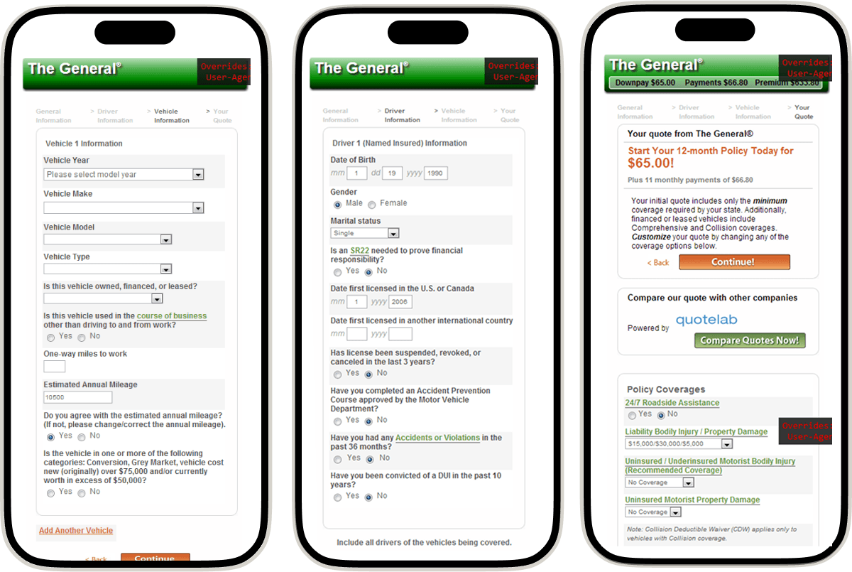
Mobile experience required too many steps before soft quoting
The current process for getting an insurance quote involves 25 initial steps for a soft quote and 27 more for precise quotes, totaling 52 steps. Test users found repeatedly entering personal information frustrating.
Solution to Demanding Quoting Process
Use dynamic forms and pre-filled data confirmations
Using the new tap and go interface, we implemented dynamic form content to serve users with intuitive choices for information necessary to deliver a quote quickly. Form information could be pre-filled by content partners as initial information was input which allowed users to confirm their data instead of entering it as they went along.
Solution to Demanding Quoting Process
Decreased time to get precise quotes, decrease new-customer onboarding
Time in the quoting process was cut to 10 steps. Users found the new forms easier, leading to fewer drop-offs and more conversions.


Usability testing with customers
Different methods and workflows were tested
for clarity, readability, and time to event. These
results were applied to the next round of
wireframes where each input was optimized
for the best result.
for clarity, readability, and time to event. These
results were applied to the next round of
wireframes where each input was optimized
for the best result.

Feature Challenge 2
Inefficient and poorly adapted ID retrieval and in-app self service.
Many states now use mobile insurance ID cards, making in-app ID and document retrieval necessary. However, viewing these documents involves too many steps and resizing issues affects readability. Basic tasks like eSign verifications, checking coverage status, and making changes are not easily accessible.
Solution to Inefficient Policy Management
Prioritize common tasks and add visual confirmation cues
The tap-and-go design method now lets users retrieve insurance cards in one step. Users tap a button to view cards on their mobile. Visual cues confirm changes and inform customers about coverage status and common support issues.
Outcome of Strategic “My Policy” Design
Increased customer self-service and decreased baseline support tickets
User testing showed more customers used the app for account management instead of web login. Easy changes and prioritized information helped customers manage their coverage without contacting support due to frustration with the previous time-consuming experience for simple tasks.

Feature Challenge 3
Common payment-related use cases were not addressed in-app resulting in reduced retention and inability to re-acquire lapsed customers
Users were primarily concerned about their coverage status and payment timelines before coverage suspension. This lack of notifications led to customer churn. Many struggled to get billing alerts via email. Support centers were often used for multiple payments on a policy.
Solution to Payment-related Drop Offs
Introduced split pay capability and SMS notification strategy
Many customers preferred mobile experiences over email, so text-message alerts for coverage payments became a better way for them to track their status. The app also featured coverage alerts and partner ads for payment help. We added a split pay feature and a contact option to ease payment arrangements, allowing policyholders to invite payment providers to use the app for custom payment amounts.

Outcome of Reimagined Payment Design
Increased retention and reacquisition increased profitability
Churn significantly decreased as customers planned ahead for payments and maintained accounts within known grace periods. Partner advertising and services offered a revenue base and a single source for essential services. Call center interactions for payments reduced, and many policy members installed the app on their phones for this purpose.
(*|;{
Messaging to increase retention
Early shadowing across multiple departments provided key insight into The Generals customers.

See the success of the Flying Circle approach
Data and Science Technologies
Transportation AI
Enterprise Mobile Experiences
Enterprise Mobile Experiences
Data and Science Technologies
Education
Health
Health
See the success of the Flying Circle approach
Data and Science
Technologies
Technologies
Transportation AI
Enterprise Mobile
Experiences
Experiences
Enterprise Mobile
Experiences
Experiences
Data and Science
Technologies
Technologies
Education
Health